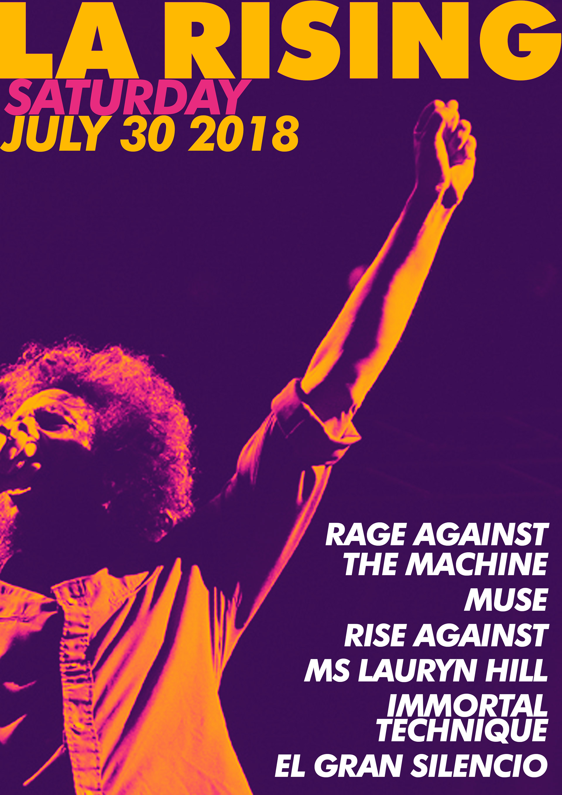
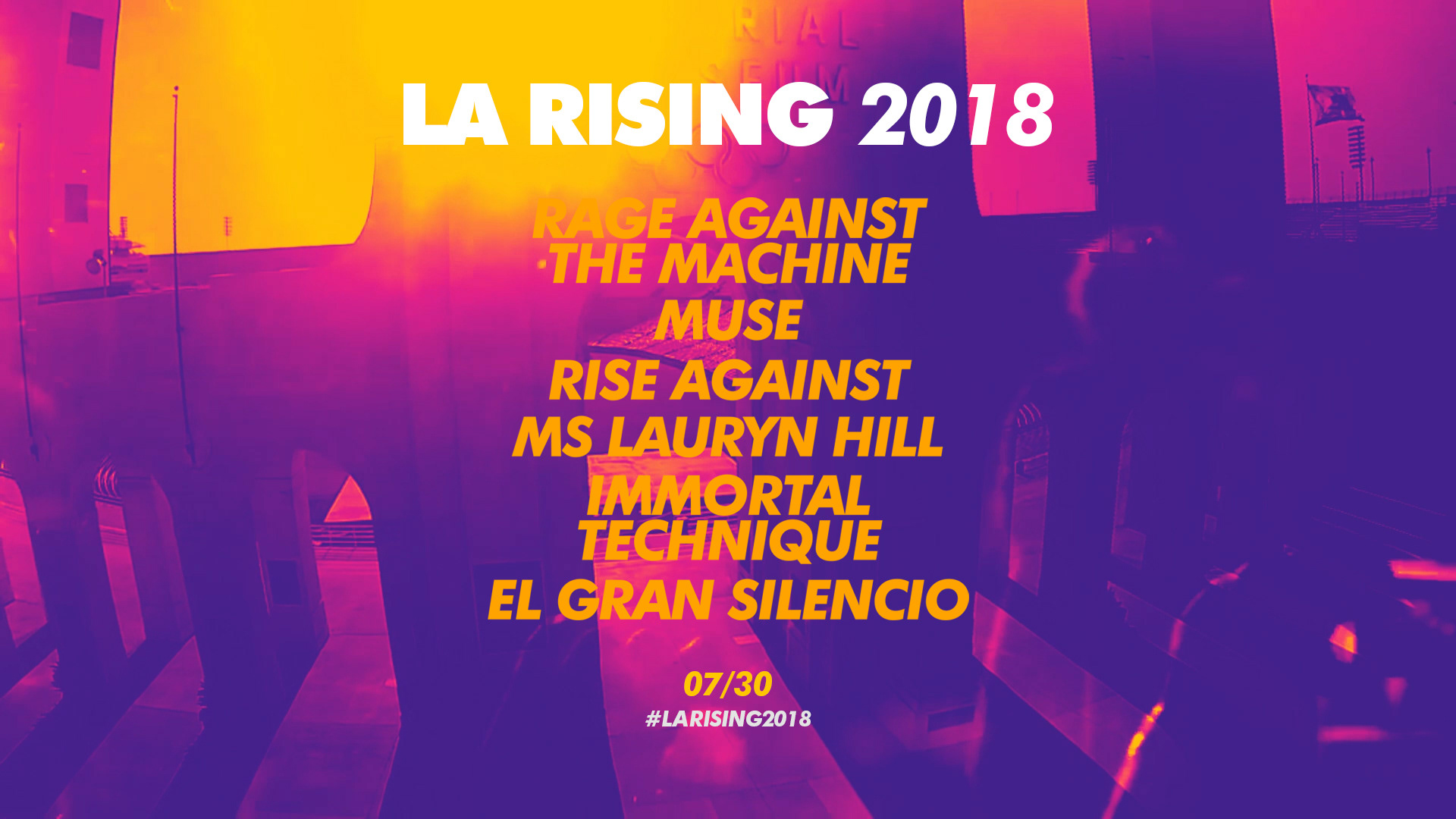
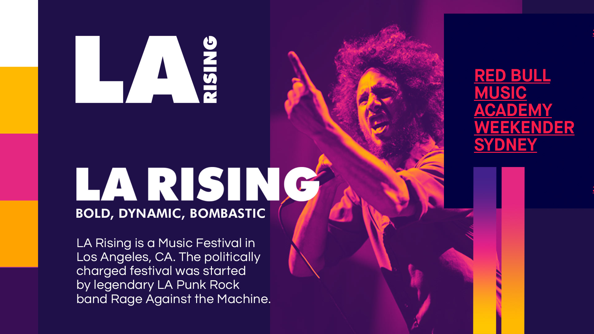
LA Rising was a Music Festival in 2011 organized by the members of Los Angeles Punk Metal band Rage Against the Machine. As a festival, LA Rising reflects the biting political criticism and raw sound of its creators. The line up featured politically charged artists such as Immortal Technique, Ms Lauryn Hill, Rise Against, and Muse alongside the aforementioned Rage Against the Machine. The festival was scheduled as the finale to the band's reunion tour as their last live show. The festival was announced to continue annually, however the festival had not returned. TJK Design wanted to create a Design Concept project for the music festival if it was brought back in 2018.
Phase 1: Exploration + Concept Development
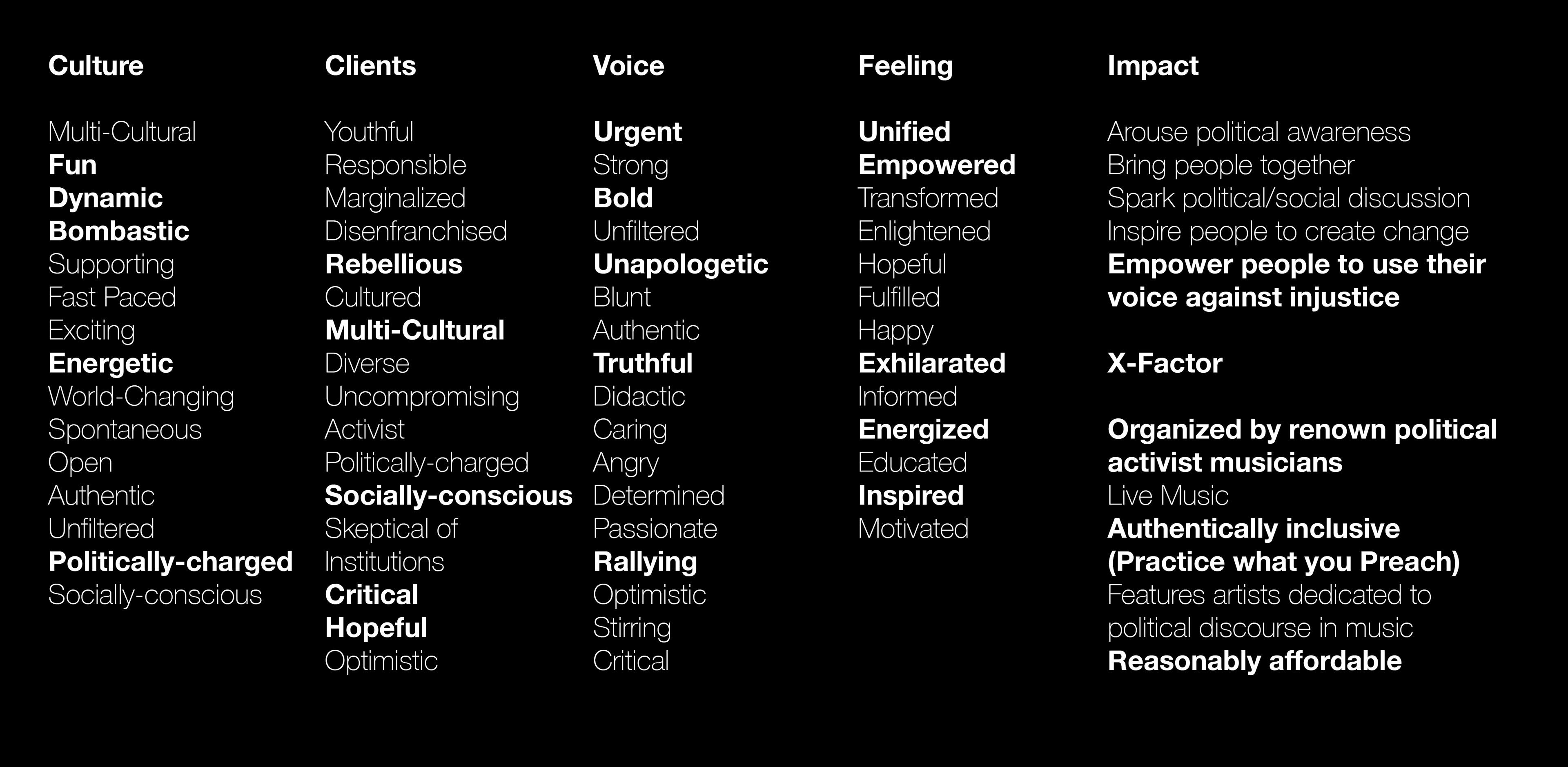
Working from an existing festival that I was there to experience personally meant that building a list of Brand Attributes was incredibly simple. Since this project is a Design concept without a true client based off of an existing brand, the exercise for Brand attributes is a demonstration of how the process would work at its core.
The Brand attribute for the festival was even easier due to its incredibly focused purpose at its conception. The festival was meant to occupy a single location with a singular purpose every year. Had the festival not been cancelled, every consecutive year would be a great opportunity for the brand to compound on its purpose and message further.
The Brand attribute for the festival was even easier due to its incredibly focused purpose at its conception. The festival was meant to occupy a single location with a singular purpose every year. Had the festival not been cancelled, every consecutive year would be a great opportunity for the brand to compound on its purpose and message further.
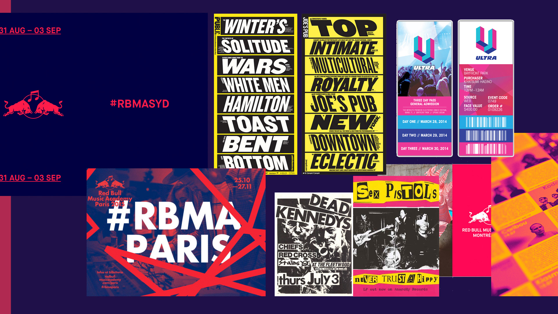
Phase 2: Exploration of Brand Personality
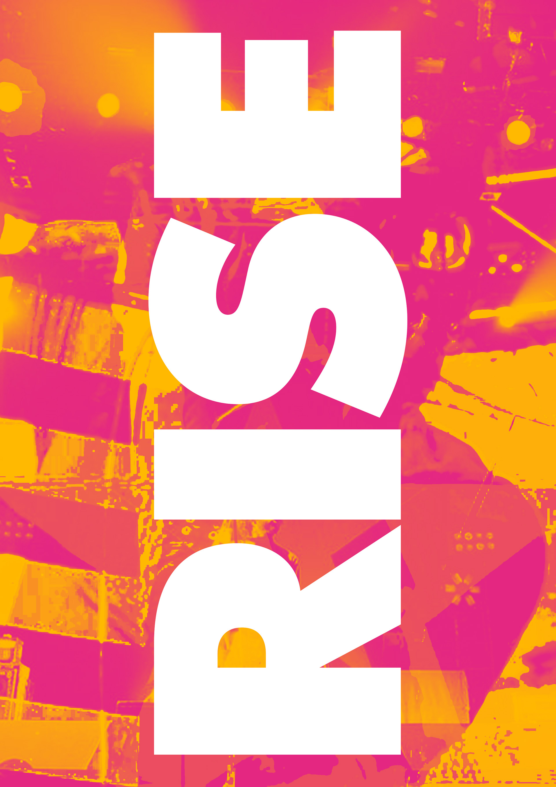
Phase 2 builds off from the Brand Attributes discovered in Phase 1. We constructed a style guide to focus the brand's look/feel, voice/tone, and behaviors logged during Discovery into visuals.
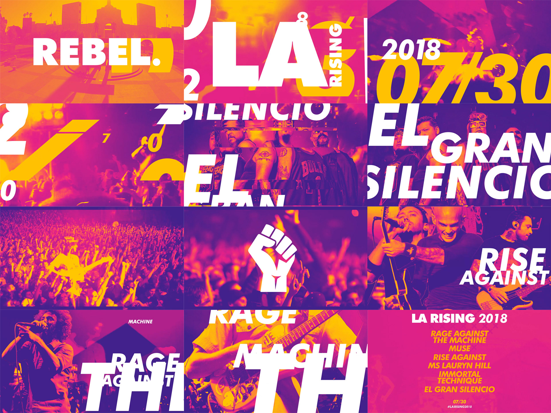
The purpose of this stylescape is to craft a hyper-focused mood board that is centered around specific brand attributes and strategy decided in the discovery sessions.
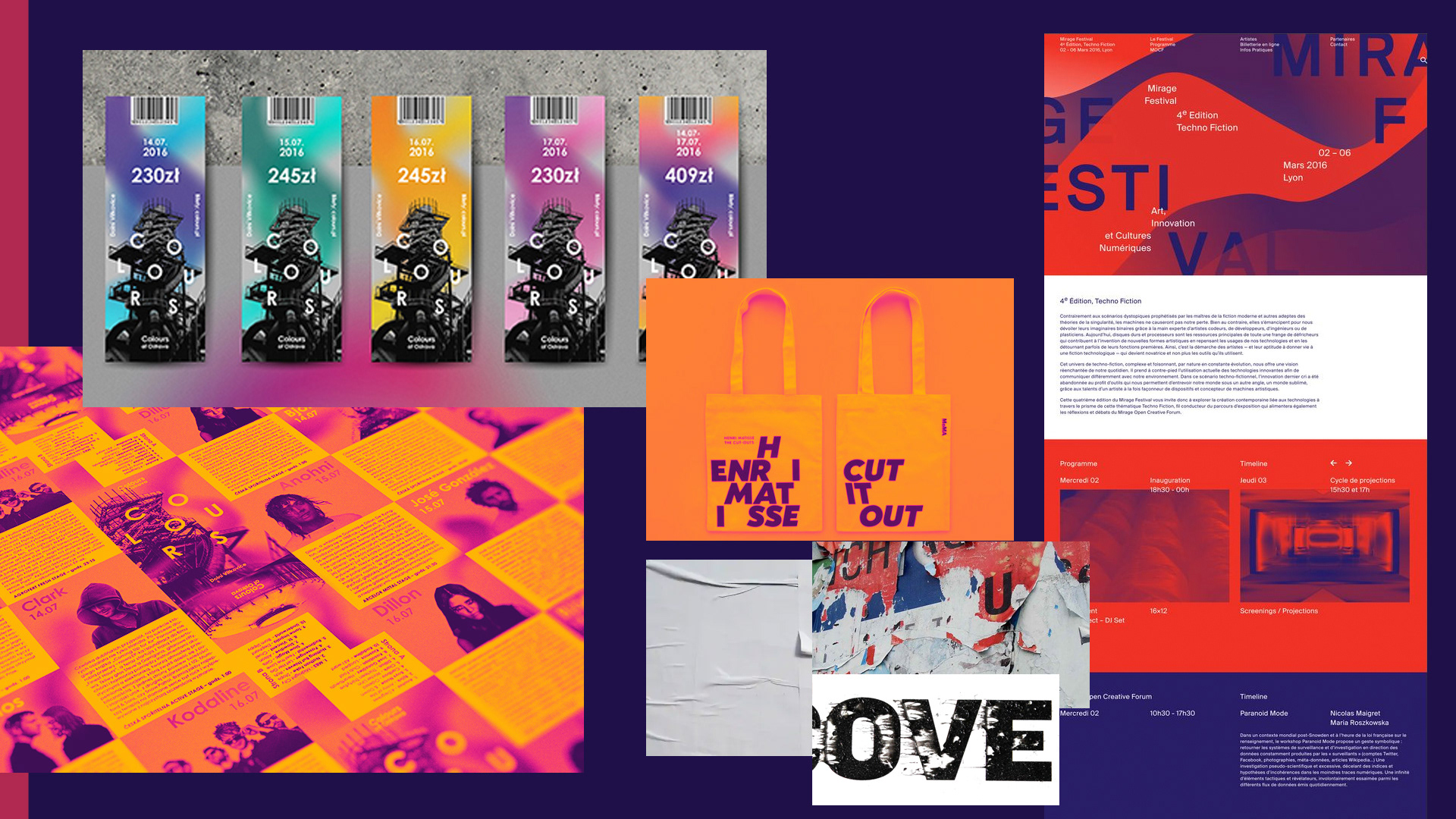
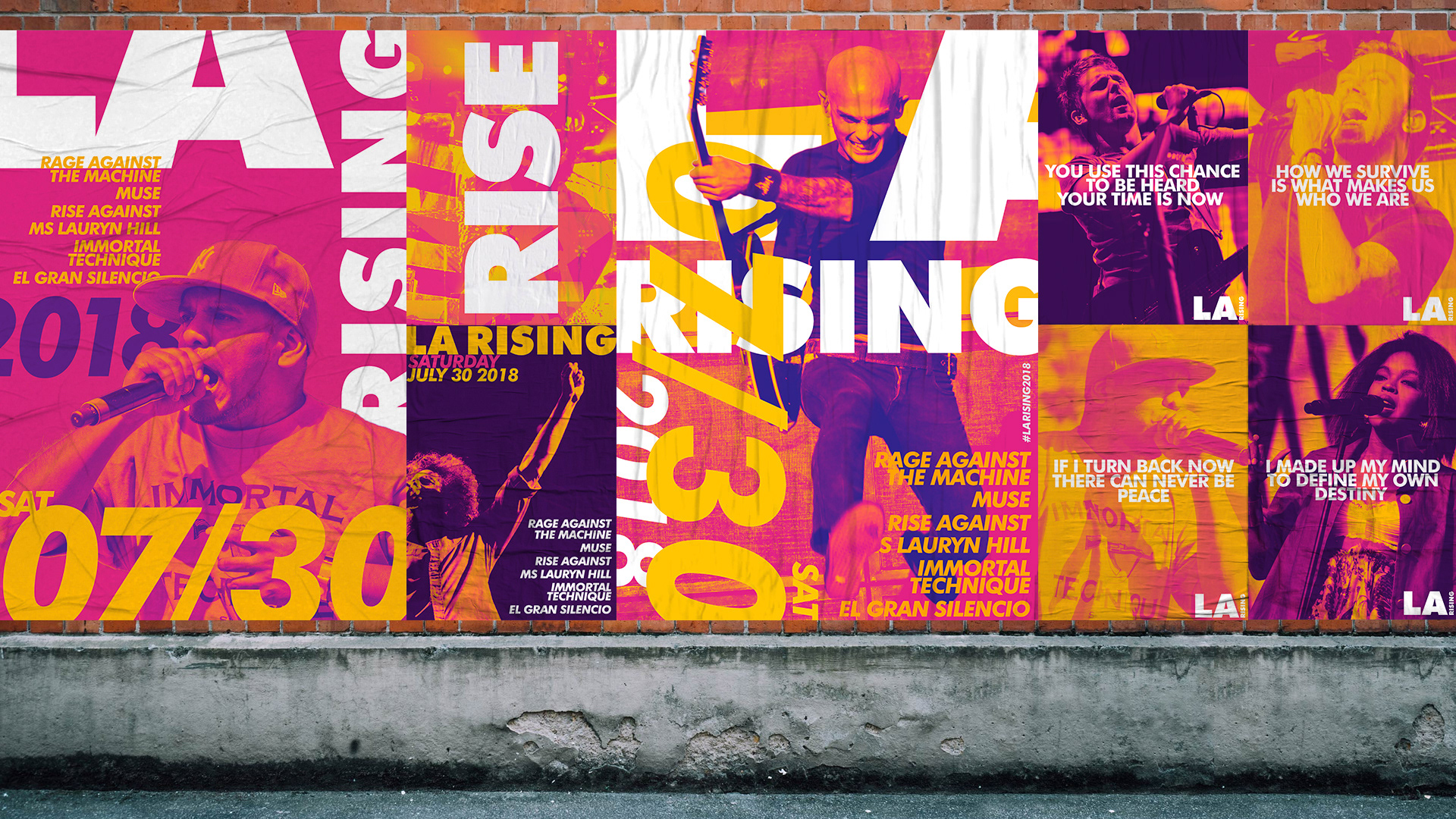
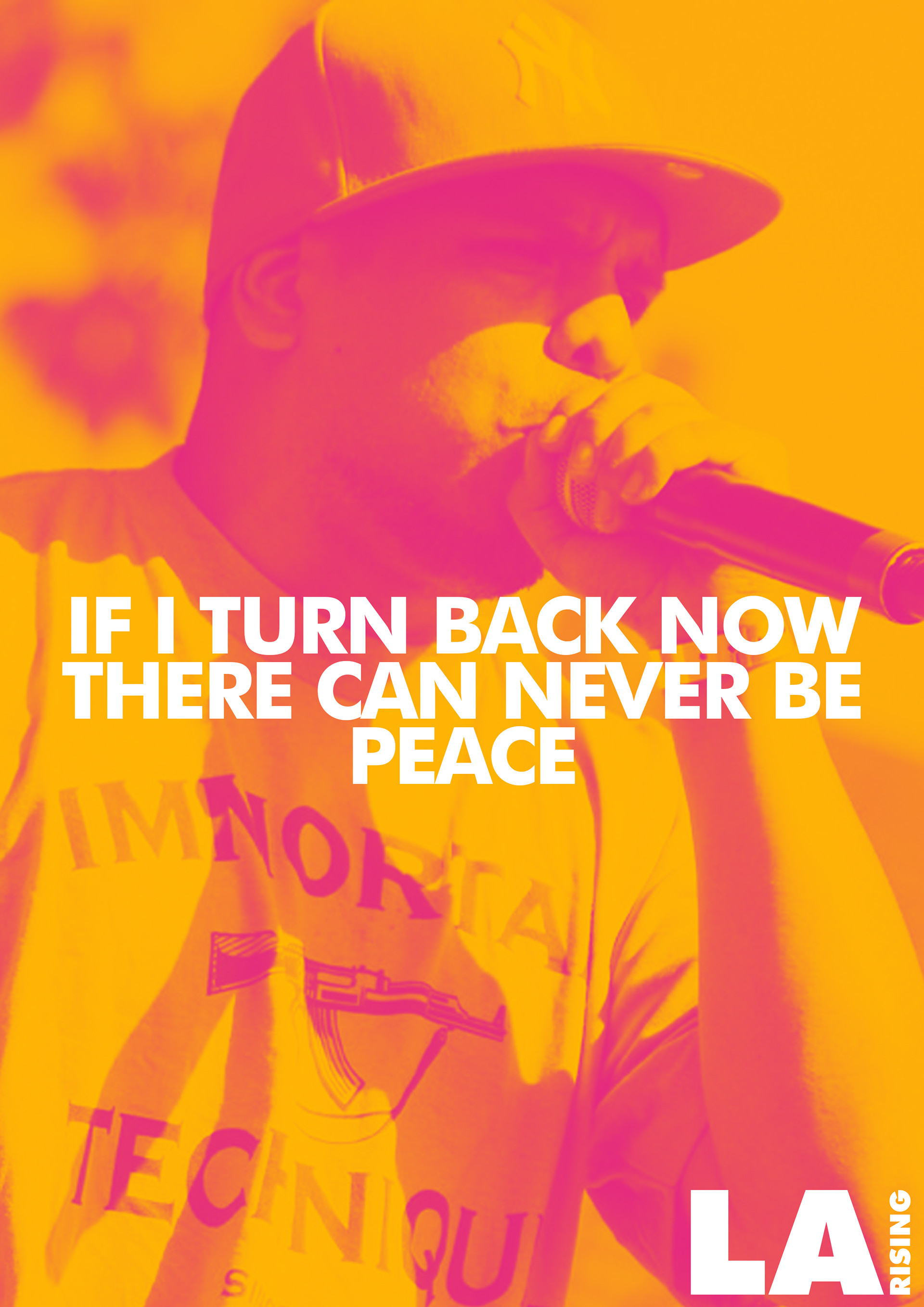
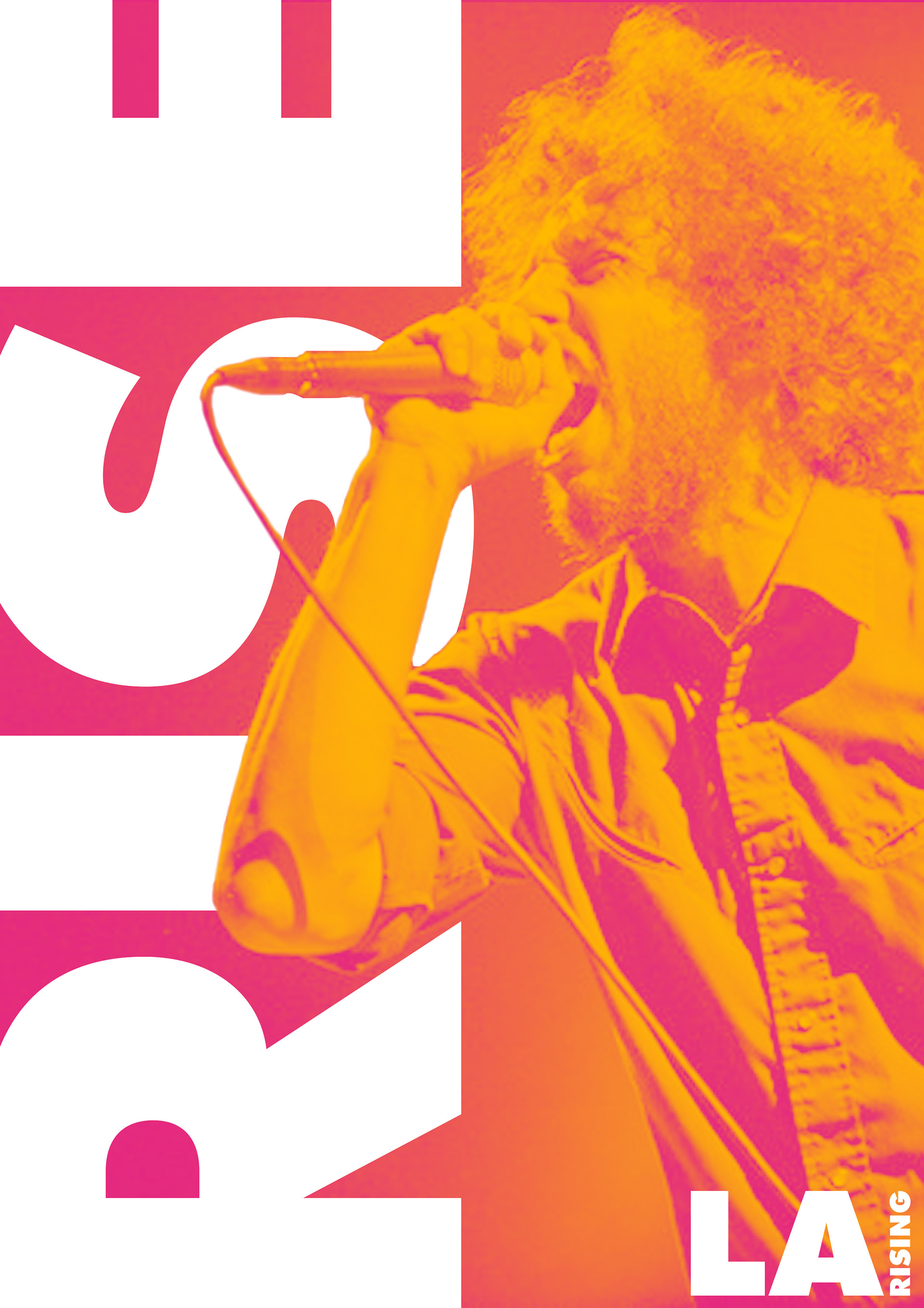
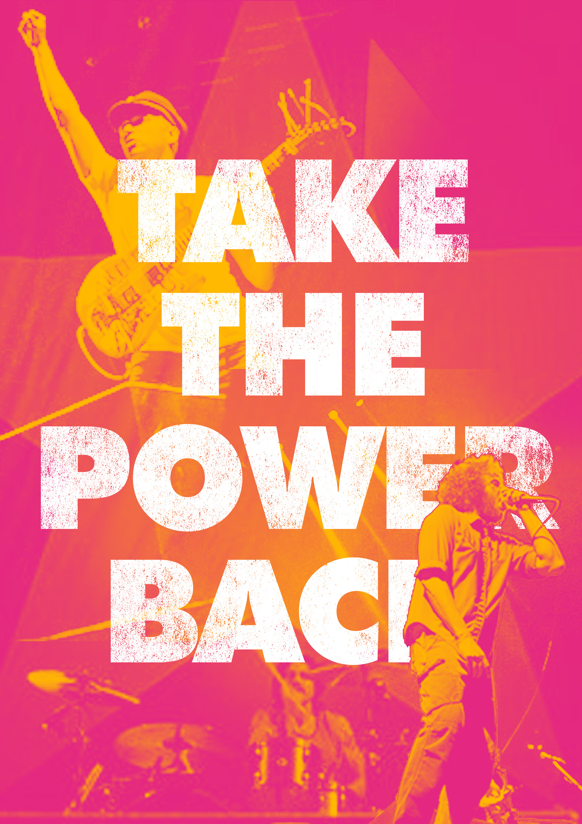
Phase 3: Exploration of Brand Applications
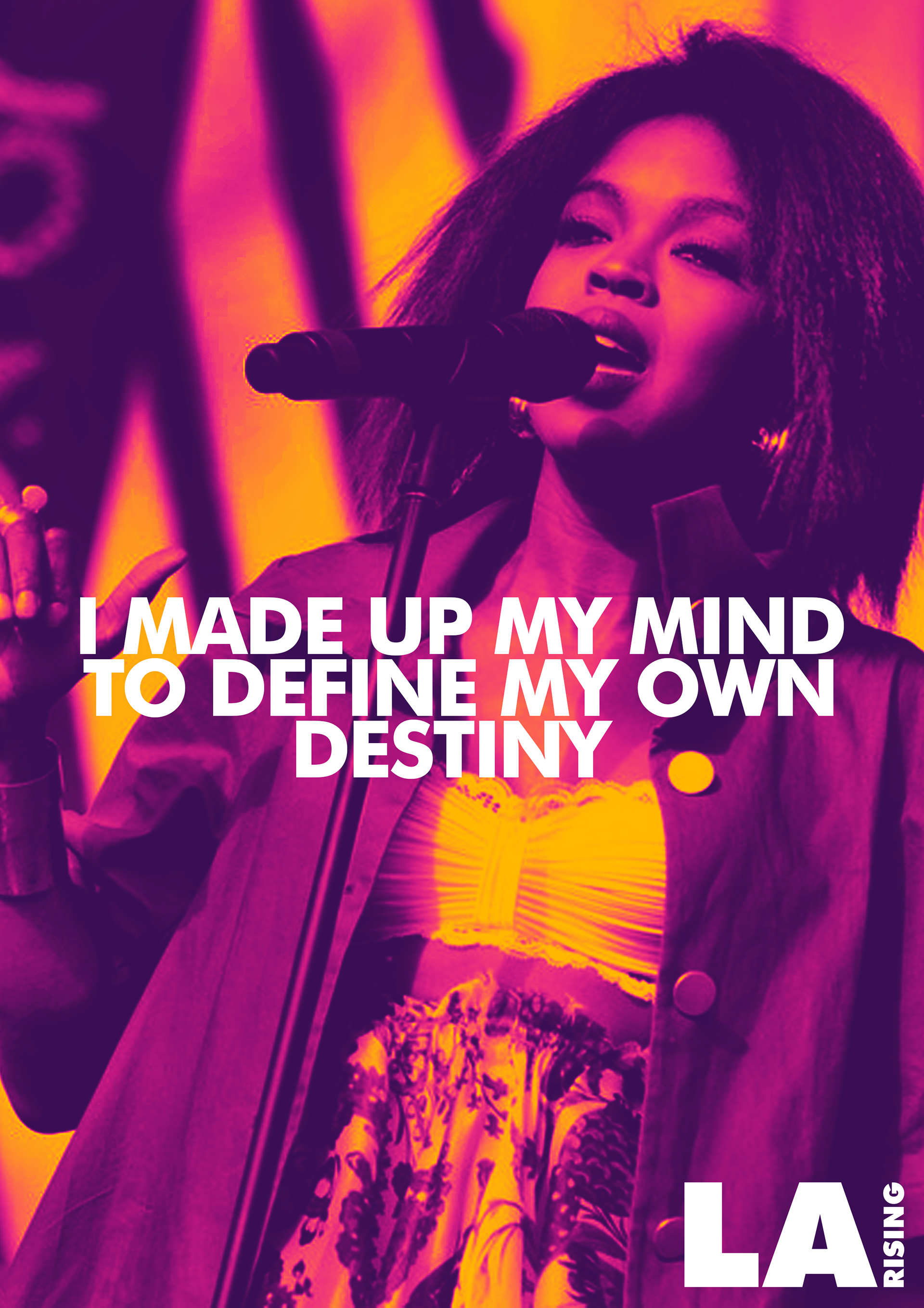
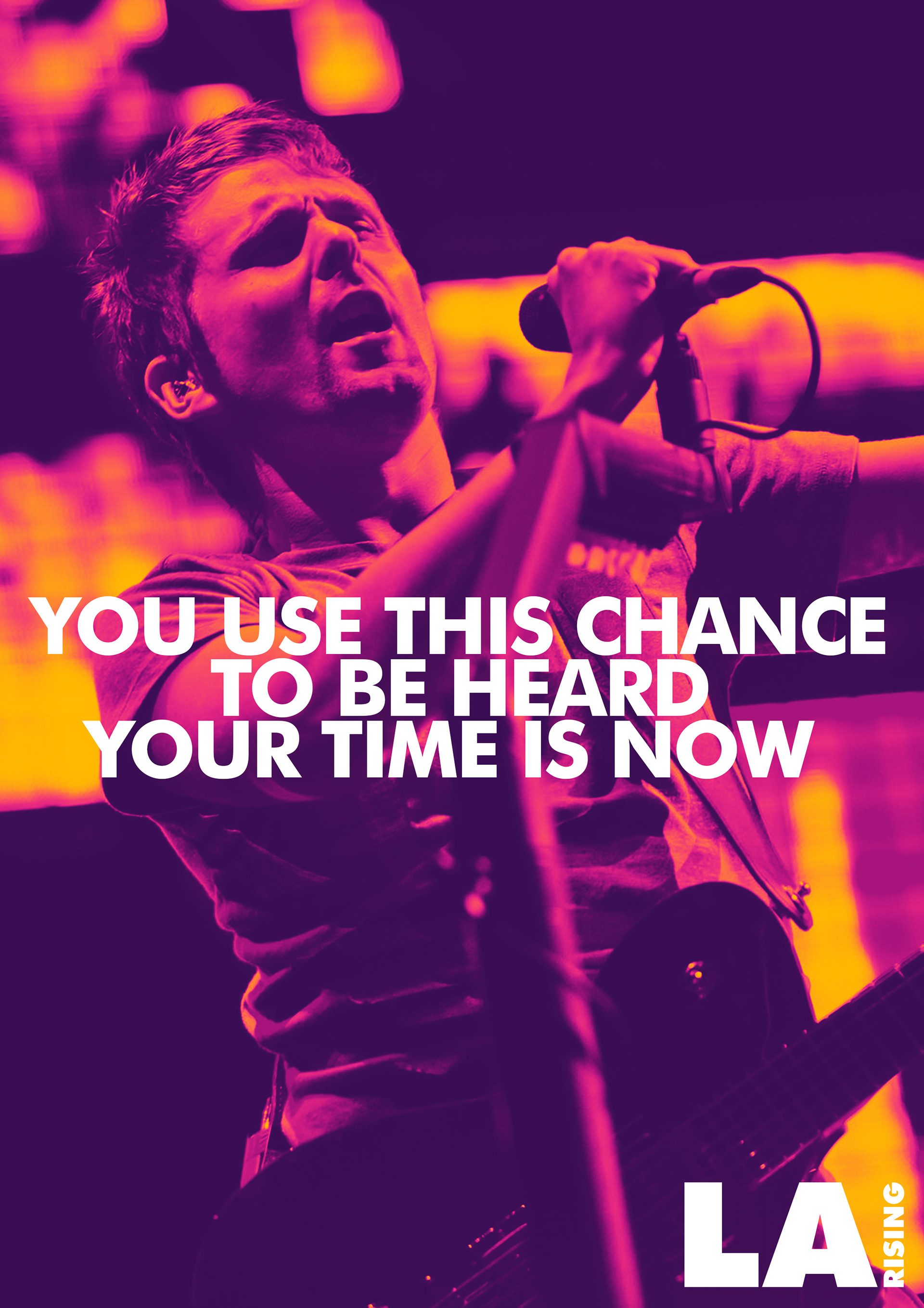
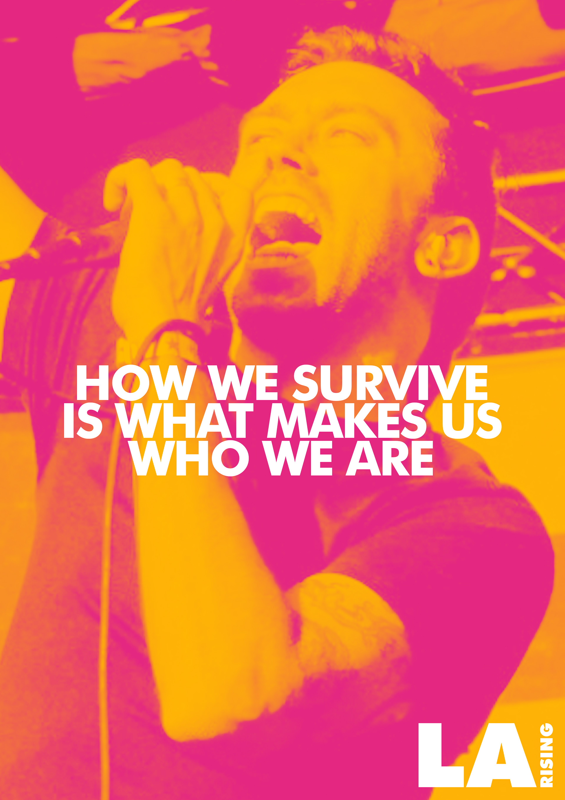
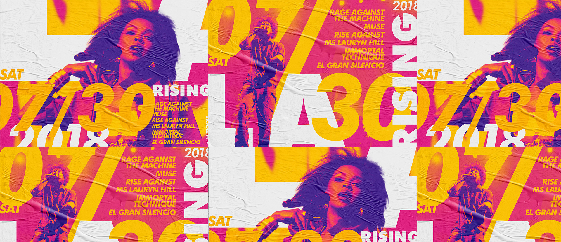
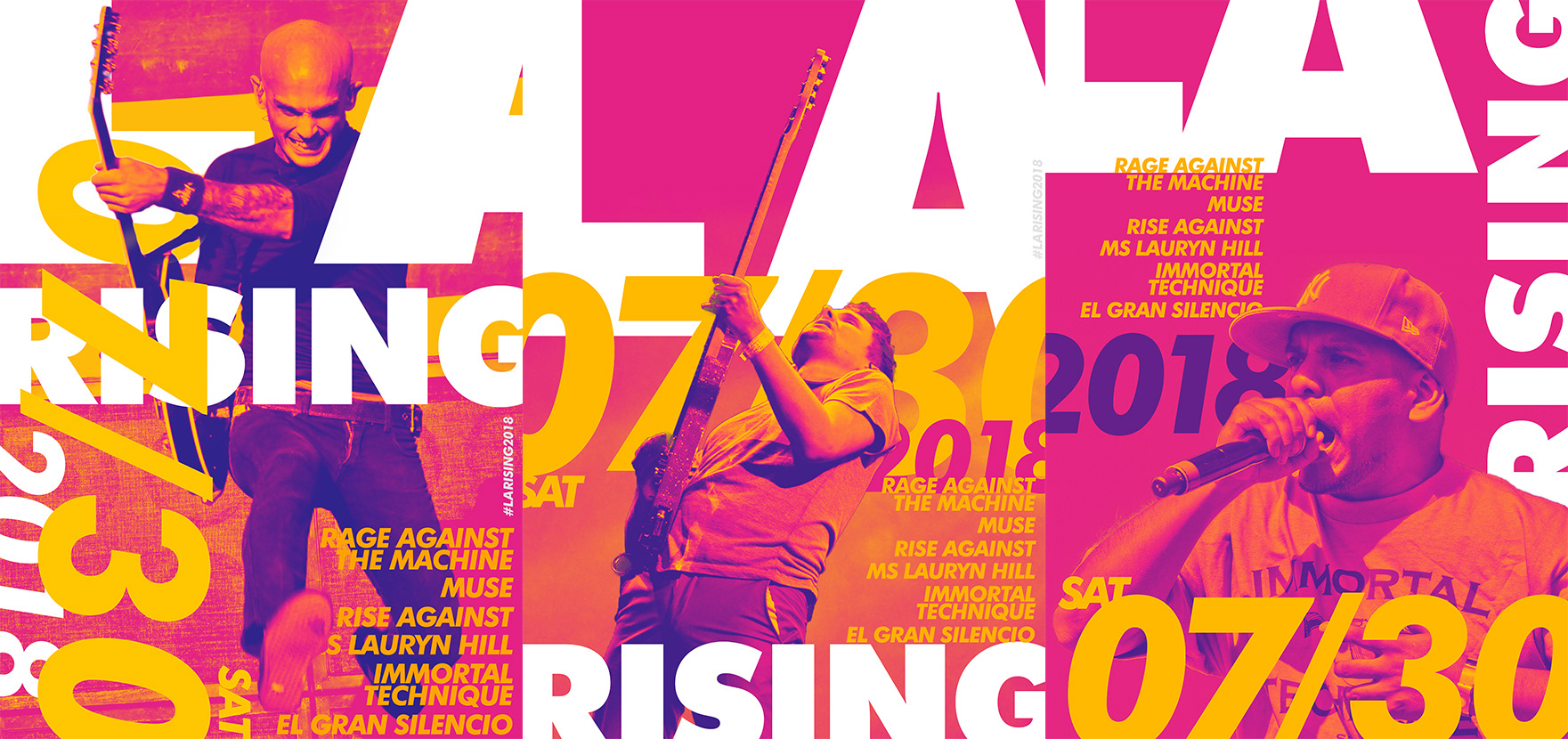
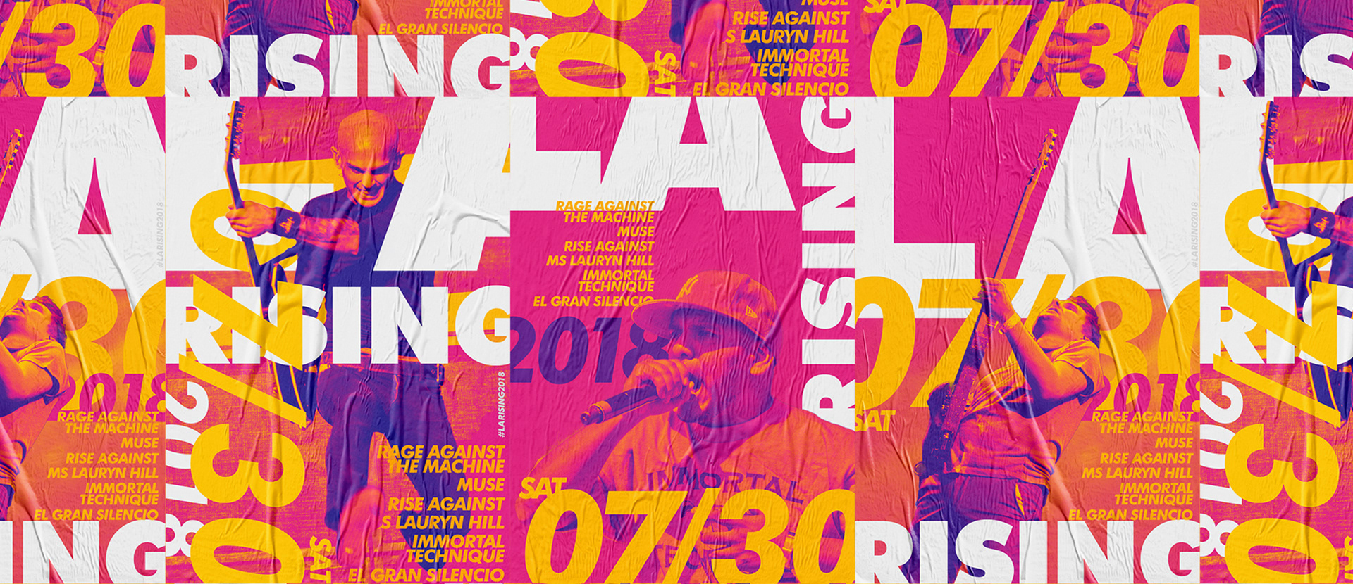
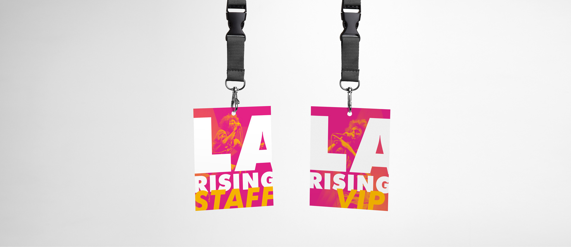
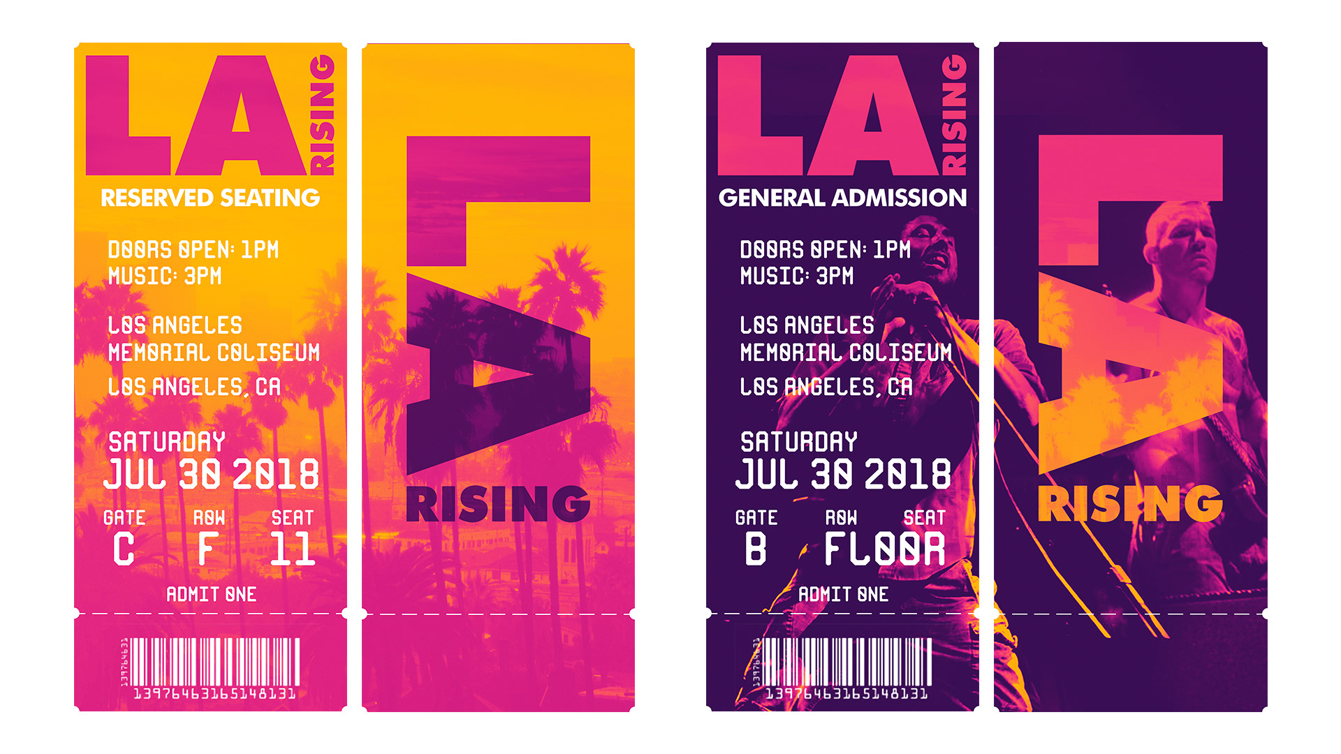
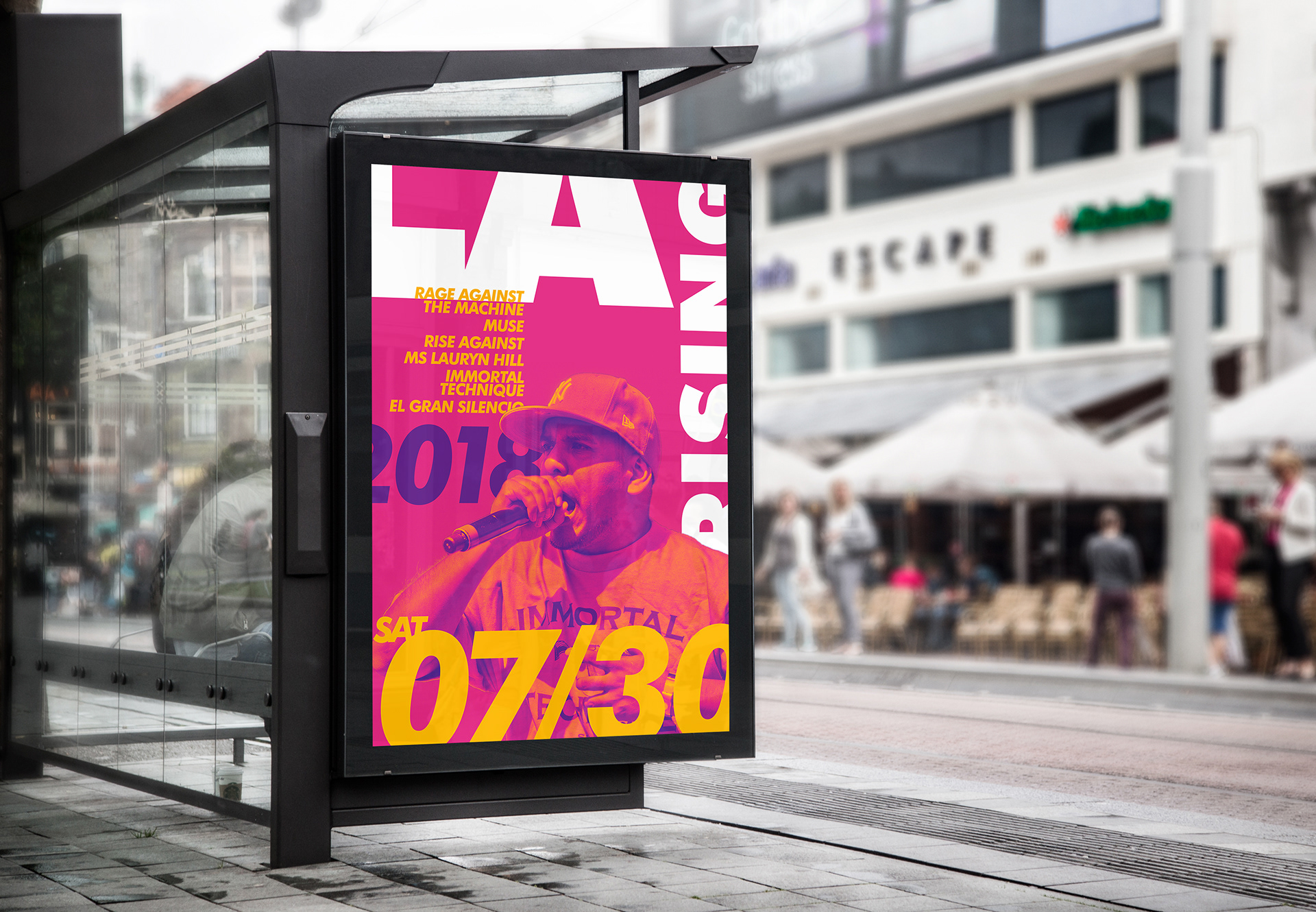
The posters here are visual applications of the Brand's style guide below. The colors, typography, and photo treatment inform the visual treatment of all our applications. We applied Brand Messaging for the festival from the lyrics of the featured artists to function as marketing content. We also wanted to build applications for Festival specific paraphernalia such as tickets and ID badges.