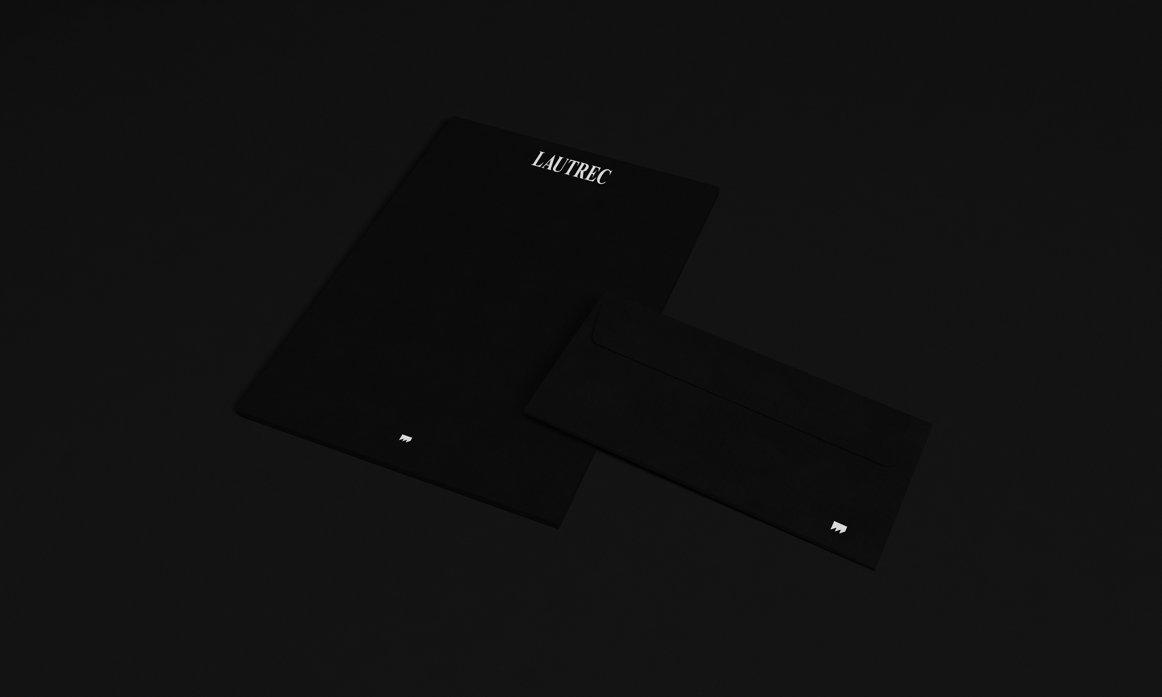
Final Logomark & Logotype
Lautrec is a Los Angeles-based Korean-American singer/songwriter. TJK Design was tasked to create a brand identity and brand strategy to transmute the artist’s variety of tastes and ideas into a visual medium. The client’s music varies wildly in soundscapes and genres, drawing from various influences in Rock, Blues, Jazz and electronic music. The challenge was to faithfully capture the numerous aesthetic and thematic elements of the client's music, and translate those ideas into an identity.
Phase 1: Discovery & Concept Development
The first phase in our practice at TJK Design is to identify the brand. Simply, the brand isn't what we present to the client's audience, rather the brand is the audience perception of our client. Phase 1 is about discovering the attributes that exist inherently and the attributes that our client wishes to strive towards.

Discovery Session: Brand Attributes
Working with Lautrec was more of a rebranding. The client was previously part of a band, then a solo act that eventually underwent through many transformations to become Lautrec. The client had set out an outline for music tracks to be thematically curated into future album projects. The objective was to take past ideas and identify a way to reposition the artist from his past projects, into its own separate identity.
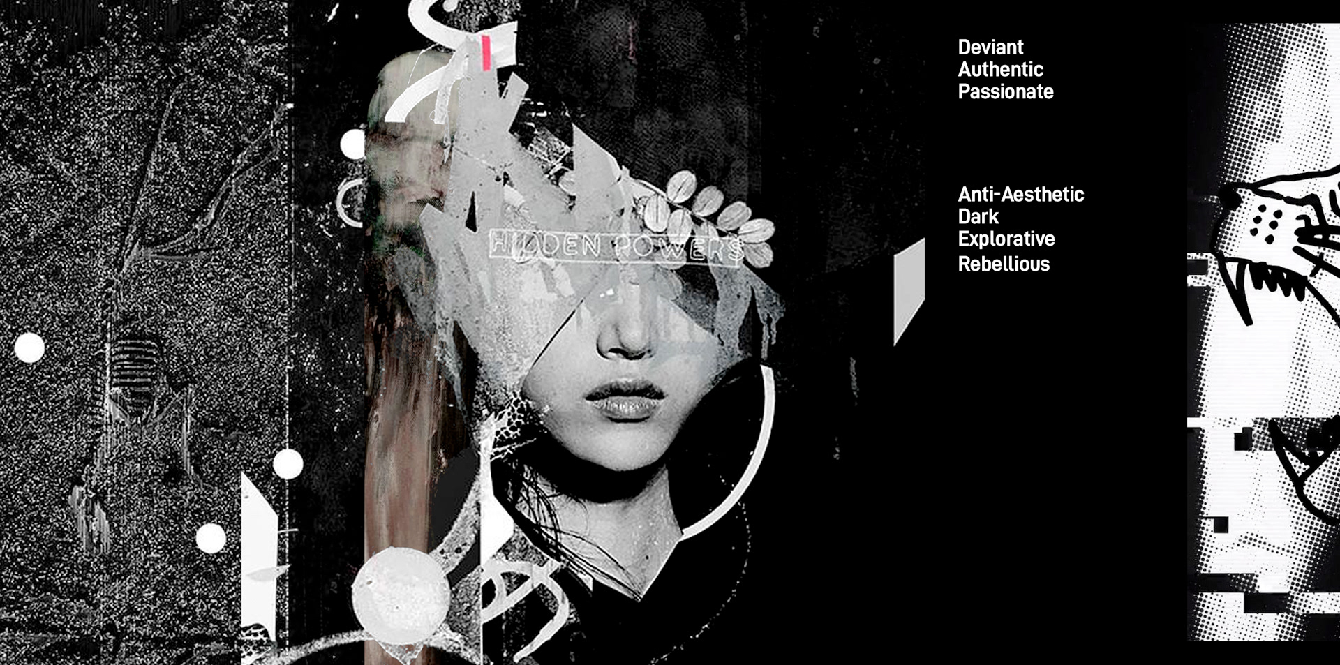
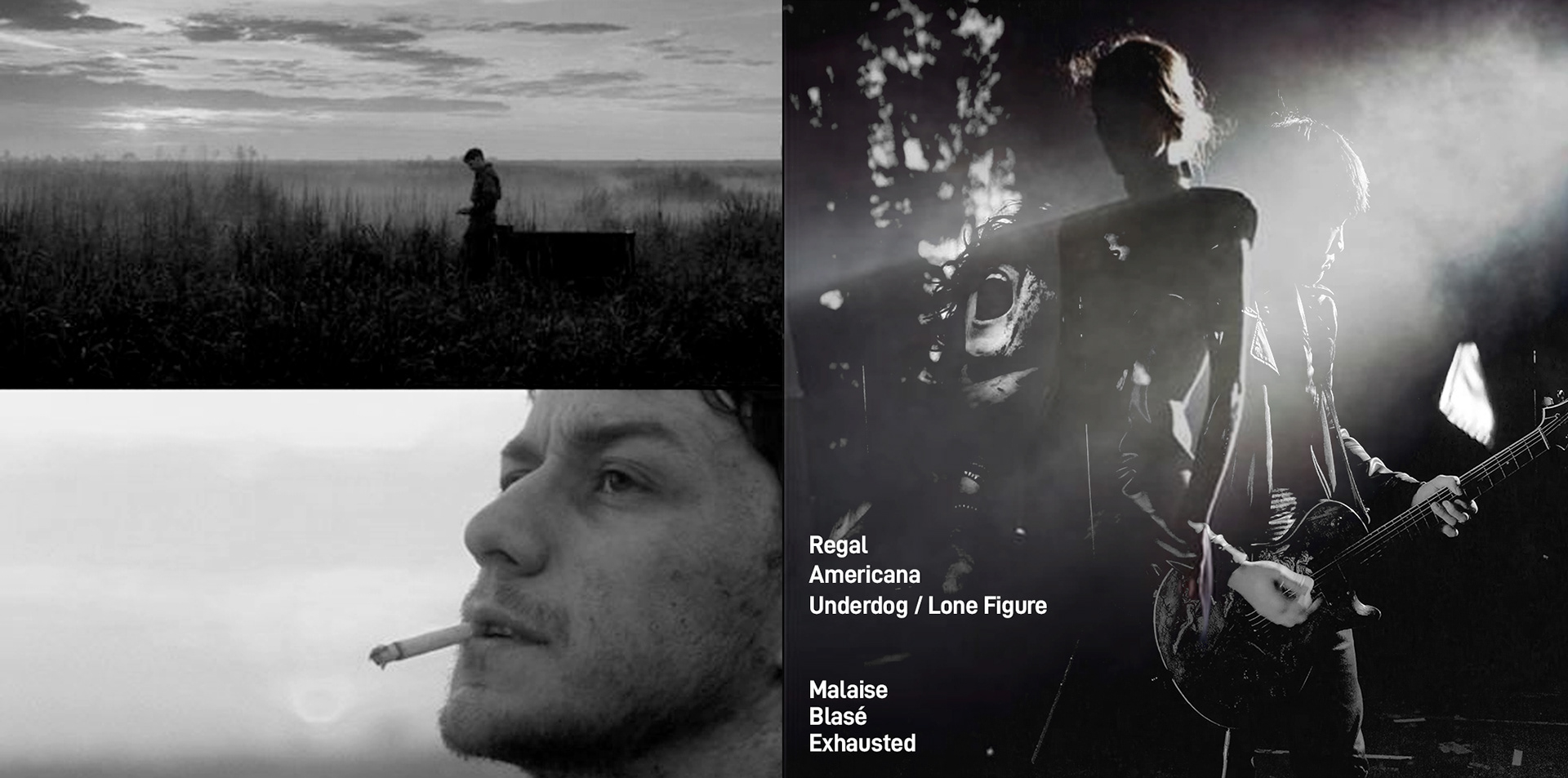
My first step in the process is to put everything into language. The initial step is to put down the keywords that we want people to perceive and associate with the artist. The list was created together and the client selected the keywords that most accurately defined his identity.
My first step in the process is to put everything into language. The initial step is to put down the keywords that we want people to perceive and associate with the artist. The list was created together and the client selected the keywords that most accurately defined his identity.
We also took note of reoccurring thematic through lines in the client's music. This discovery session proved incredibly insightful to the artistic and creative ideas that our client was particularly interested in. The discovery session with our client will prove valuable when we begin to focus in on our client's brand.
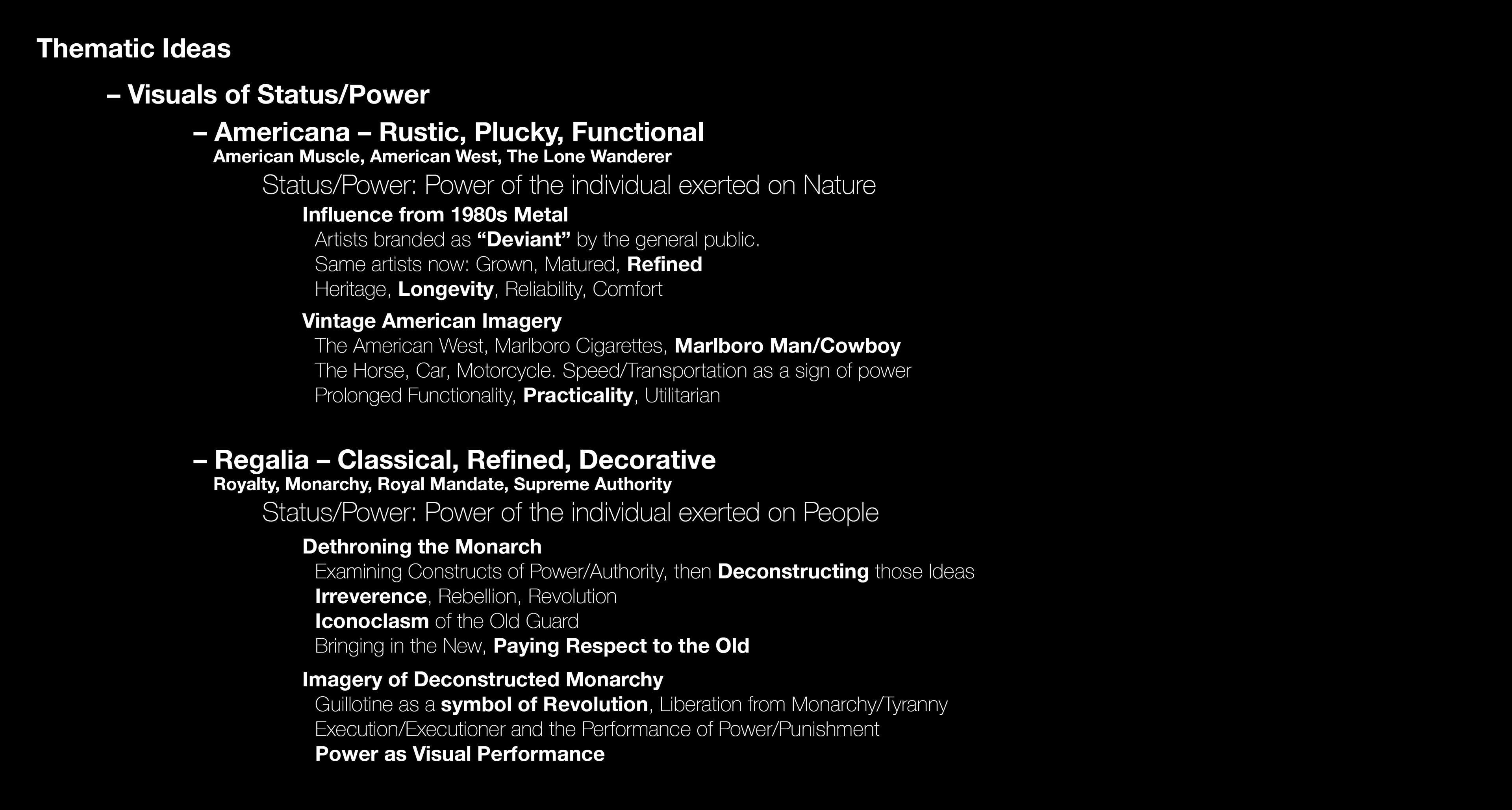
Discovery Session: Thematic Ideas in Client's Music
Phase 2: Stylescape & Logo Development
With the Brand Attributes set in a tangible state, we extrapolated those attributes and created a Stylescape presentation for our client. We wanted to focus into a wide variety of aesthetic themes that can be widely applicable to our client's music.
Stylescape: Brand Attributes

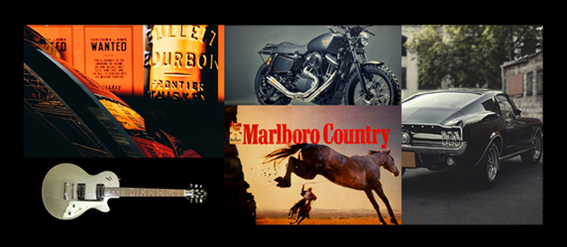
Stylescape: Thematic Ideas
The process to create the Lautrec Logo started with the thematic ideas . The visual similarities between the graphical element on Marlboro Cigarette packs and the Guillotine blade became the springboard for creating our client's Logo.
Music artists are prone to evolve dramatically over time due to changes in trends both within and outside of the music industry. Therefore, the logo must serve as a constant throughout the artist's career as a singular identifiable marker that represents the artist and his ideals.
Music artists are prone to evolve dramatically over time due to changes in trends both within and outside of the music industry. Therefore, the logo must serve as a constant throughout the artist's career as a singular identifiable marker that represents the artist and his ideals.
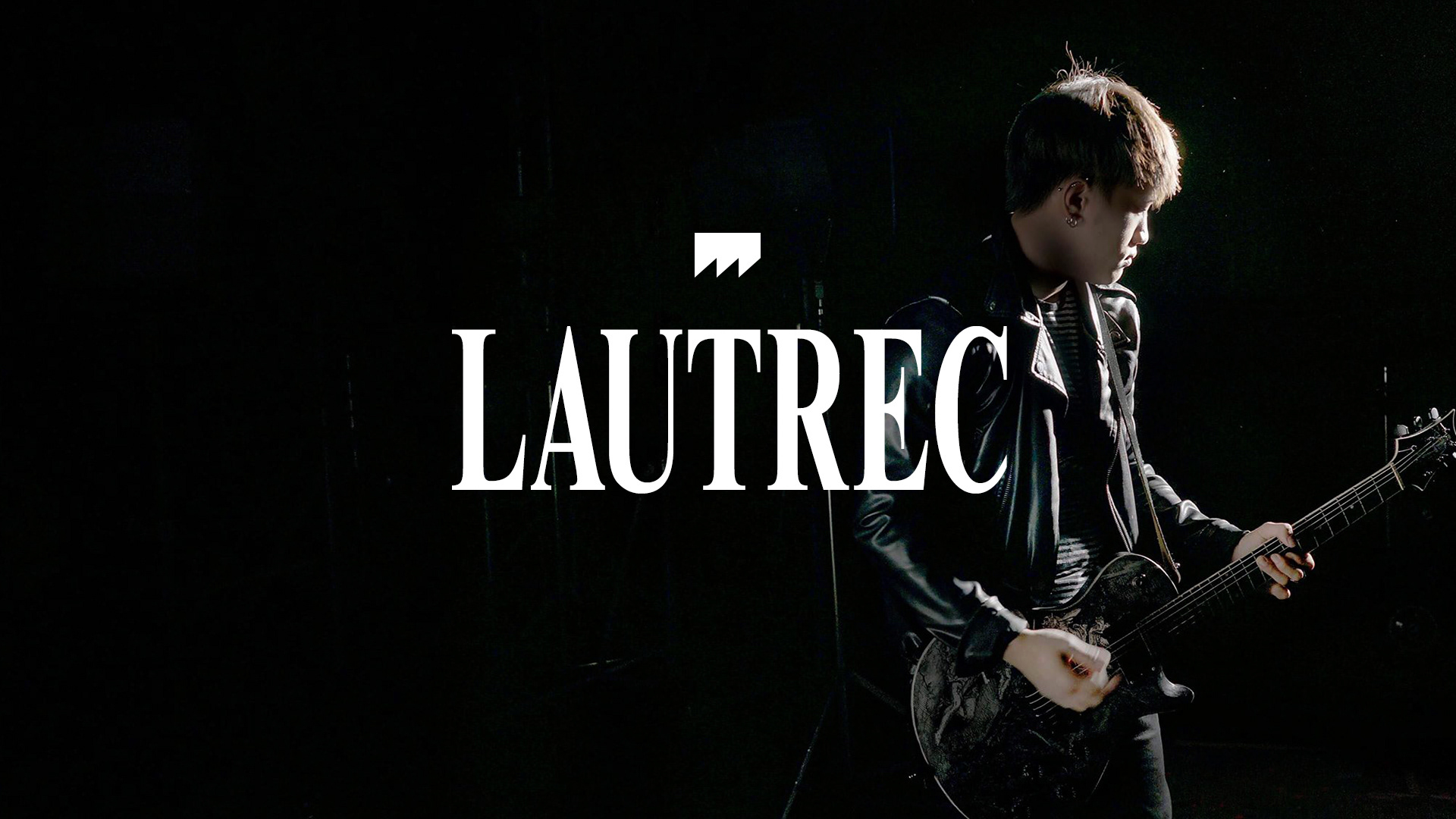
Drawing from our insights in Phase 2, the client wanted to use a type treatment that expressed both regal elegance and rustic American heritage. We decided upon using an extremely condensed Times New Roman for Lautrec.
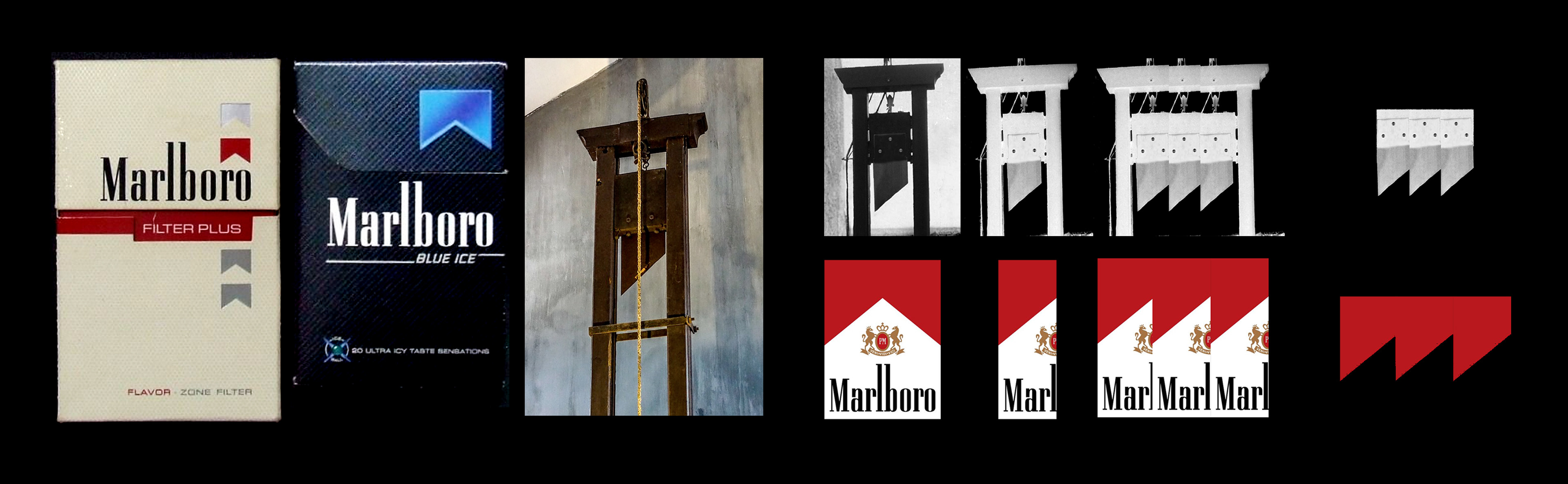
Lautrec Logomark Design Process

Final Logomark & Logotype
Phase 3: Exploration of Brand Applications
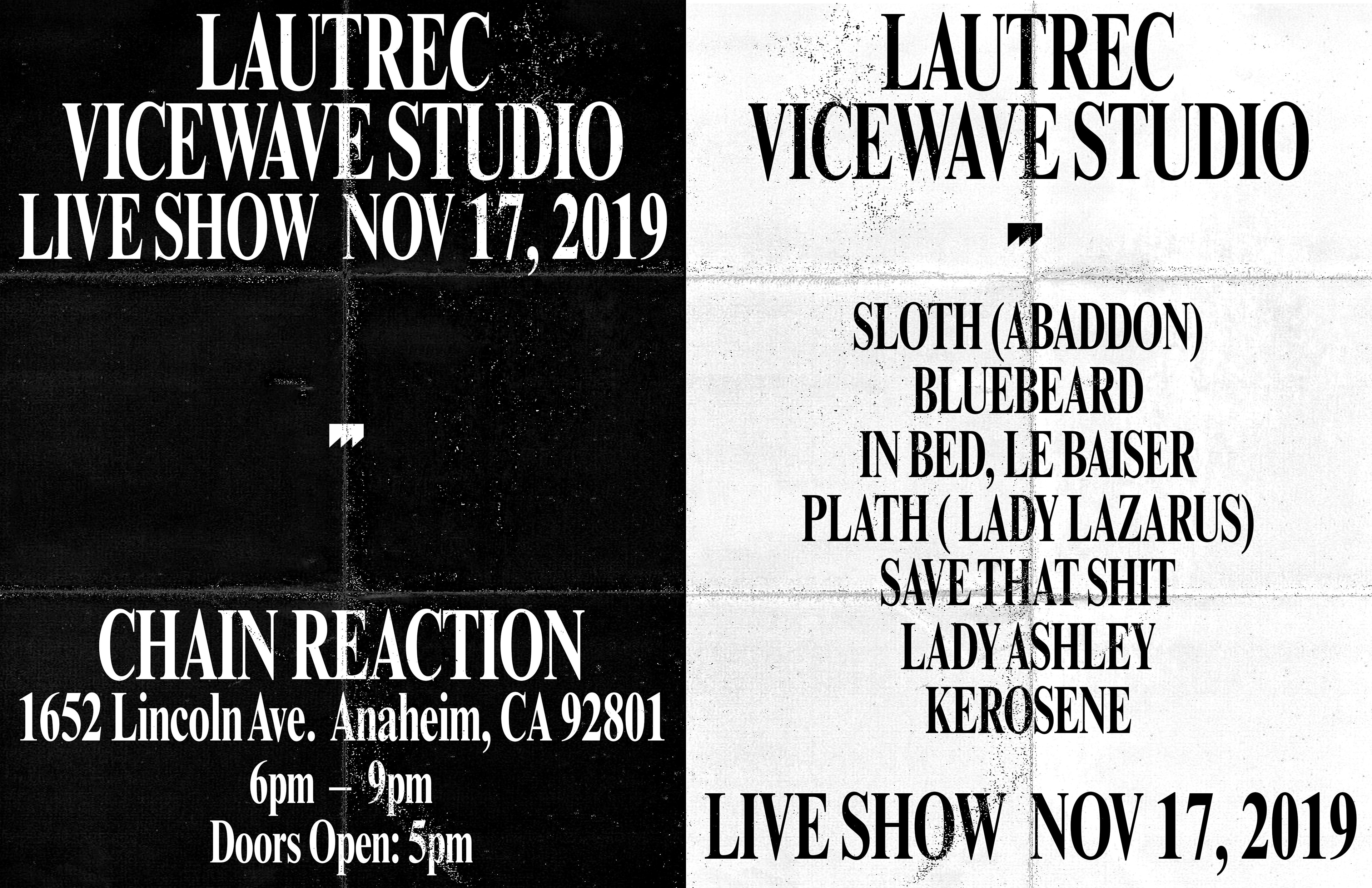
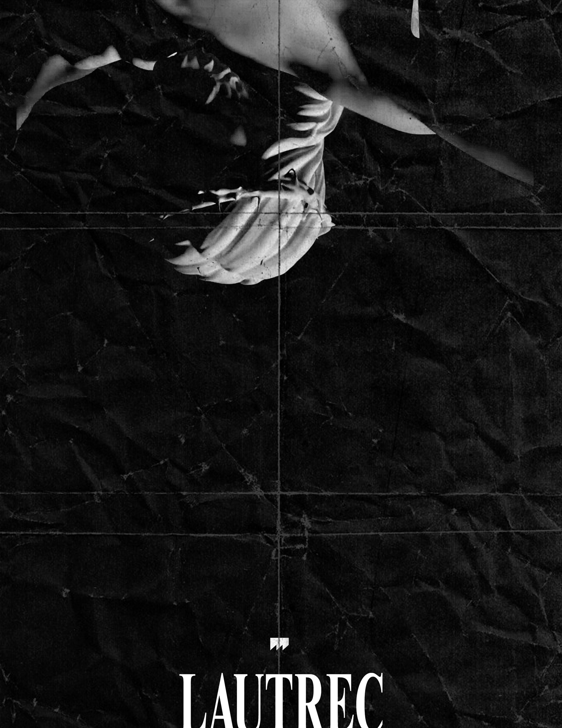
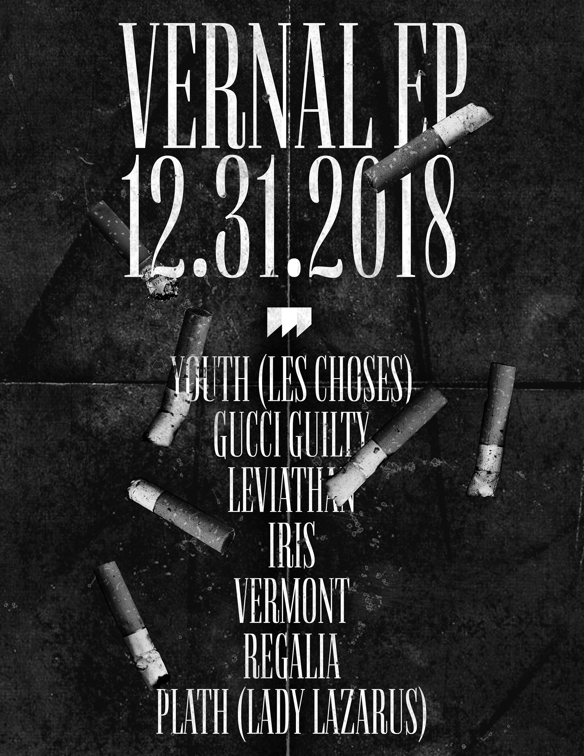
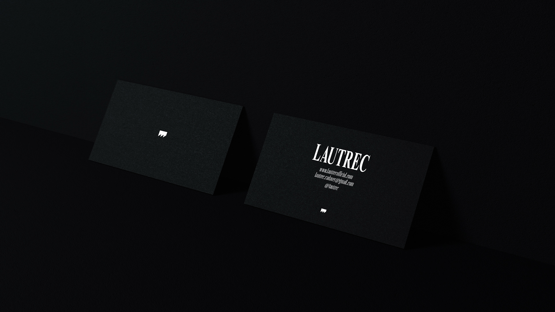
Applications of Lautrec's logo and logotype were to be expressed more concisely with elegance and grace, allowing the logo and the type to speak for itself without additional clutter. Outside of clerical uses, the simplicity of the logo and logotype allow for artistic usage of images and subject matter.
Applications in posters, merchandise, videos, etc should look visually distinct from stationary applications.